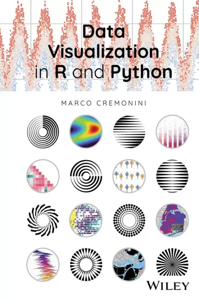
Data Visualization in R and Python
Оглавление⌄
CoverTitle PageCopyrightContentsPrefaceIntroductionAbout the Companion WebsitePart I Static Graphics with ggplot (R) and Seaborn (Python)Chapter 1 Scatterplots and Line Plots1.1 R: ggplot1.1.1 Scatterplot1.1.2 Repulsive Textual Annotations: Package ggrepel1.1.3 Scatterplots with High Number of Data Points1.1.4 Line Plot1.2 Python: Seaborn1.2.1 Scatterplot1.2.2 Line PlotChapter 2 Bar Plots2.1 R: ggplot2.1.1 Bar Plot and Continuous Variables: Ranges of Values2.2 Python: Seaborn2.2.1 Bar Plot with Three Variables2.2.2 Ranges of Values from a Continuous Variable2.2.3 Visualizing SubplotsChapter 3 Facets3.1 R: ggplot3.1.1 Case 1: Temperature3.1.2 Case 2: Air Quality3.2 Python: Seaborn3.2.1 Facet for Scatterplots and Line Plot3.2.2 Line Plot3.2.3 Facet and Graphics for Categorical Variables3.2.4 Facet and Bar Plots3.2.5 Facets: General MethodChapter 4 Histograms and Kernel Density Plots4.1 R: ggplot4.1.1 Univariate Analysis4.1.2 Bivariate Analysis4.1.3 Kernel Density Plots4.2 Python: Seaborn4.2.1 Univariate Analysis4.2.2 Bivariate Analysis4.2.3 Logarithmic ScaleChapter 5 Diverging Bar Plots and Lollipop Plots5.1 R: ggplot5.1.1 Diverging Bar Plot5.1.2 Lollipop Plot5.2 Python: Seaborn5.2.1 Diverging Bar PlotChapter 6 Boxplots6.1 R: ggplot6.2 Python: SeabornChapter 7 Violin Plots7.1 R: ggplot7.1.1 Violin Plot and Scatterplot7.1.2 Violin Plot and Boxplot7.2 Python: SeabornChapter 8 Overplotting, Jitter, and Sina Plots8.1 Overplotting8.2 R: ggplot8.2.1 Categorical Scatterplot8.2.2 Violin Plot and Scatterplot with Jitter8.2.3 Sina Plot8.2.4 Beeswarm Plot8.2.5 Comparison Between Jittering, Sina plot, and Beeswarm plot8.3 Python: Seaborn8.3.1 Strip Plot and Swarm Plot8.3.2 Sina PlotChapter 9 Half‐Violin Plots9.1 R: ggplot9.1.1 Custom Function9.1.2 Raincloud Plot9.2 Python: SeabornChapter 10 Ridgeline Plots10.1 History of the Ridgeline10.2 R: ggplotChapter 11 Heatmaps11.1 R: ggplot11.2 Python: SeabornChapter 12 Marginals and Plots Alignment12.1 R: ggplot12.1.1 Marginal12.1.2 Plots Alignment12.1.3 Rug Plot12.2 Python: Seaborn12.2.1 Subplots12.2.2 Marginals: Joint Plot12.2.3 Marginals: Joint GridChapter 13 Correlation Graphics and Cluster Maps13.1 R: ggplot13.1.1 Cluster Map13.2 Python: Seaborn13.2.1 Cluster Map13.3 R: ggplot13.3.1 Correlation Matrix13.4 Python: Seaborn13.4.1 Correlation Matrix13.4.2 Diagonal Correlation Heatmap13.4.3 Scatterplot HeatmapPart II Interactive Graphics with AltairChapter 14 Altair Interactive Plots14.1 Scatterplots14.1.1 Static Graphics14.1.1.1 JSON Format: Data Organization14.1.1.2 Plot Alignment and Variable Types14.1.2 Facets14.1.3 Interactive Graphics14.1.3.1 Dynamic Tooltips14.1.3.2 Interactive Legend14.1.3.3 Dynamic Zoom14.1.3.4 Mouse Hovering and Contextual Change of Color14.1.3.5 Drop‐Down Menu and Radio Buttons14.1.3.6 Selection with Brush14.1.3.7 Graphics as Legends14.2 Line Plots14.2.1 Static Graphics14.2.2 Interactive Graphics14.2.2.1 Highlighted Lines with Mouse Hover14.2.2.2 Aligned Tooltips14.3 Bar Plots14.3.1 Static Graphics14.3.1.1 Diverging Bar Plot14.3.1.2 Plots with Double Scale14.3.1.3 Stacked Bar Plots14.3.1.4 Sorted Bars14.3.2 Interactive Graphics14.3.2.1 Synchronized Bar Plots14.3.2.2 Bar Plot with Slider14.4 Bubble Plots14.4.1 Interactive Graphics14.4.1.1 Bubble Plot with Slider14.5 Heatmaps and Histograms14.5.1 Interactive Graphics14.5.1.1 Heatmaps14.5.1.2 HistogramsPart III Web DashboardsChapter 15 Shiny Dashboards15.1 General Organization15.2 Second Version: Graphics and Style Options15.3 Third Version: Tabs, Widgets, and Advanced Themes15.4 Observe and ReactiveChapter 16 Advanced Shiny Dashboards16.1 First Version: Sidebar, Widgets, Customized Themes, and Reactive/Observe16.1.1 Button Widget: Observe Context16.1.2 Button Widget: Mode of Operation16.1.3 HTML Data Table16.2 Second Version: Tabs, Shinydashboard, and Web Scraping16.2.1 Shiny Dashboard16.2.2 Web Scraping of HTML Tables16.2.3 Shiny Dashboards and Altair Graphics Integration16.2.4 Altair and Reticulate: Installation and Configuration16.2.5 Simple Dashboard for Testing Shiny‐Altair Integration16.3 Third Version: Altair Graphics16.3.1 Cleveland Plot and Other GraphicsChapter 17 Plotly Graphics17.1 Plotly Graphics17.1.1 Scatterplot17.1.2 Line Plot17.1.3 Marginals17.1.4 FacetsChapter 18 Dash Dashboards18.1 Preliminary Operations: Import and Data Wrangling18.1.1 Import of Modules and Submodules18.1.2 Data Import and Data‐Wrangling Operations18.2 First Dash Dashboard: Base Elements and Layout Organization18.2.1 Plotly Graphic18.2.2 Themes and Widgets18.2.3 Reactive Events and Callbacks18.2.4 Data Table18.2.5 Color Palette Selector and Data Table Layout Organization18.3 Second Dash Dashboard: Sidebar, Widgets, Themes, and Style Options18.3.1 Sidebar, Multiple Selection, and Checkbox18.3.2 Dark Themes18.3.3 Radio Buttons18.3.4 Bar Plot18.3.5 Container18.4 Third Dash Dashboard: Tabs and Web Scraping of HTML Tables18.4.1 Multi‐page Organization: Tabs18.4.2 Web Scraping of HTML Tables18.4.3 Second Tab's Layout18.4.4 Second Tab's Reactive Events18.5 Fourth Dash Dashboard: Light Theme, Custom CSS Style Sheet, and Interactive Altair Graphics18.5.1 Light Theme and External CSS Style Sheet18.5.2 Altair GraphicsPart IV Spatial Data and Geographic MapsChapter 19 Geographic Maps with R19.1 Spatial Data19.2 Choropleth Maps19.2.1 Eurostat – GISCO: giscoR19.3 Multiple and Annotated Maps19.3.1 From ggplot to Plotly Graphics19.4 Spatial Data (sp) and Simple Features (sf)19.4.1 Natural Earth19.4.2 Format sp and sf: Centroid and Polygons19.4.3 Differences Between Format sp and Format sf19.5 Overlaid Graphical Layers19.6 Shape Files and GeoJSON Datasets19.7 Venice: Open Data Cartography and Other Maps19.7.1 Tiled Web Maps19.7.1.1 Package ggmap19.7.1.2 Package Leaflet19.7.2 Tiled Web Maps and Layers of sf Objects19.7.2.1 Tiled Web Maps with ggmap19.7.2.2 Tiled Web Map with Leaflet19.7.3 Maps with Markers and Annotations19.8 Thematic Maps with tmap19.8.1 Static and Interactive Visualizations19.8.2 Cartographic Layers: Rome's Archaeological Sites19.9 Rome's Accommodations: Intersecting Geometries with Simple Features and tmap19.9.1 Centroids and Active Geometry19.9.2 Quantiles and Custom Legend19.9.3 Variants with Points and PopupsChapter 20 Geographic Maps with Python20.1 New York City: Plotly20.1.1 Choropleth Maps: plotly.express20.1.1.1 Dynamic Tooltips20.1.1.2 Mapbox20.1.2 Choropleth Maps: plotly.graph_objects (plotly go)20.1.3 GeoJSON Polygon, Multipolygon, and Missing id Element20.2 Overlaid Layers20.3 Geopandas: Base Map, Data Frame, and Overlaid Layers20.3.1 Extended Dynamic Tooltips20.3.2 Overlaid Layers: Dog Breeds, Dog Runs, and Parks Drinking Fountains20.4 Folium20.4.1 Base Maps, Markers, and Circles20.4.2 Advanced Tooltips and Popups20.4.3 Overlaid Layers and GeoJSON Datasets20.4.4 Choropleth Maps20.4.5 Geopandas20.4.6 Folium Heatmap20.5 Altair: Choropleth Map20.5.1 GeoJSON Maps20.5.2 Geopandas: NYC Subway Stations and Demographic DataIndexEULA
Описание
Ниже — практический обзор по теме «data».
Communicate the data that is powering our changing world with this essential text
Data Visualization, which combines the technical knowledge of how to work with data and the visual and communication skills required to present it, is an integral part of this subject. The advent of machine learning and neural networks in recent years, along with other technologies under the broader umbrella of ‘artificial intelligence,’ has produced an explosion in Data Science research and applications. The expansion of Data Science is already leading to greater demand for new approaches to Data Visualization, a process that promises only to grow.
Beginning with the fundamentals of data visualization with Python and R, two key environments for data science, the book proceeds to lay out a range of tools for data visualization and their applications in web dashboards, data science environments, graphics, maps, and more. Data Visualization in R and Python offers a thorough overview of the key dimensions of this subject. With an eye towards remarkable recent progress in open-source systems and tools, this book offers a cutting-edge introduction to this rapidly growing area of research and technological development.
Data Visualization in R and Python readers will also find:Coverage suitable for anyone with a foundational knowledge of R and Python
Detailed treatment of tools including the Ggplot2, Seaborn, and Altair libraries, Plotly/Dash, Shiny, and others
Case studies accompanying each chapter, with full explanations for data operations and logic for each, based on Open Data from many different sources and of different formats
Data Visualization in R and Python is ideal for any student or professional looking to understand the working principles of this key field.
Файл доступен для загрузки ниже.
Поделиться
Частые вопросы
Можно ли скачать «Data Visualization in R and Python» бесплатно?
Да, «Data Visualization in R and Python» доступна для бесплатного скачивания на нашем сайте в формате PDF. Ссылка на файл находится на этой странице.
В каком формате и какого размера файл?
Книга предоставляется в формате PDF, размер файла 9,3 МБ.
Кто автор и когда вышла книга?
автор — Cremonini Marco, издательство John Wiley & Sons, Inc., год выпуска 2025, 578 страниц.
О чём книга «Data Visualization in R and Python»?
Communicate the data that is powering our changing world with this essential textThe advent of machine learning and neural networks in recent years, along with other technologies under the broader umbrella of ‘artificial intelligence,’ has
Похожие материалы
 Основы программирования на Python
 Python для детей. Самоучитель по программированию
 Python. Сборник упражнений. Введение в язык Python с задачами и решениями
 Структуры данных в Python: начальный курс
 Python за 7 дней. Краткий курс для начинающих
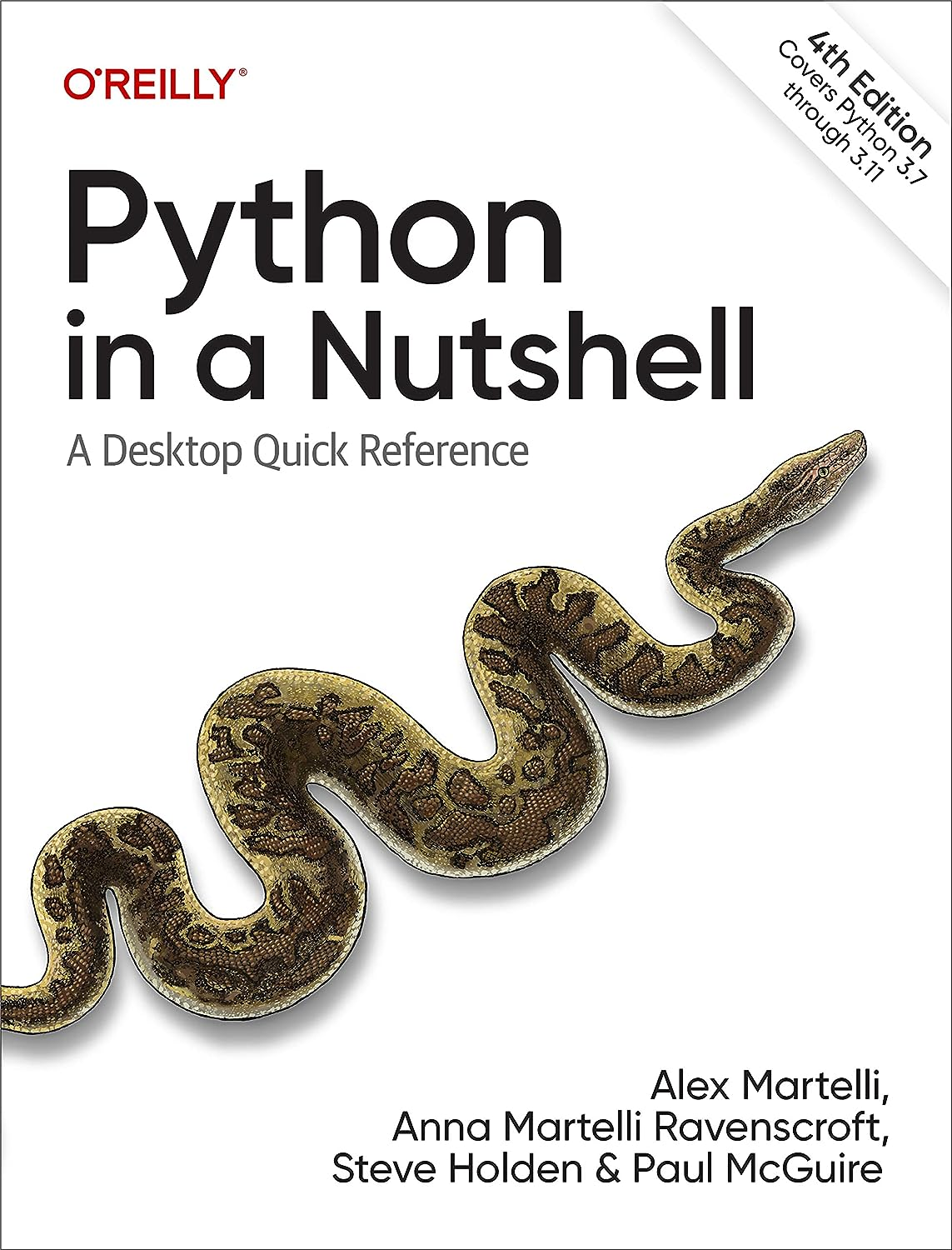 Python in a Nutshell: A Desktop Quick Reference. 4 Ed
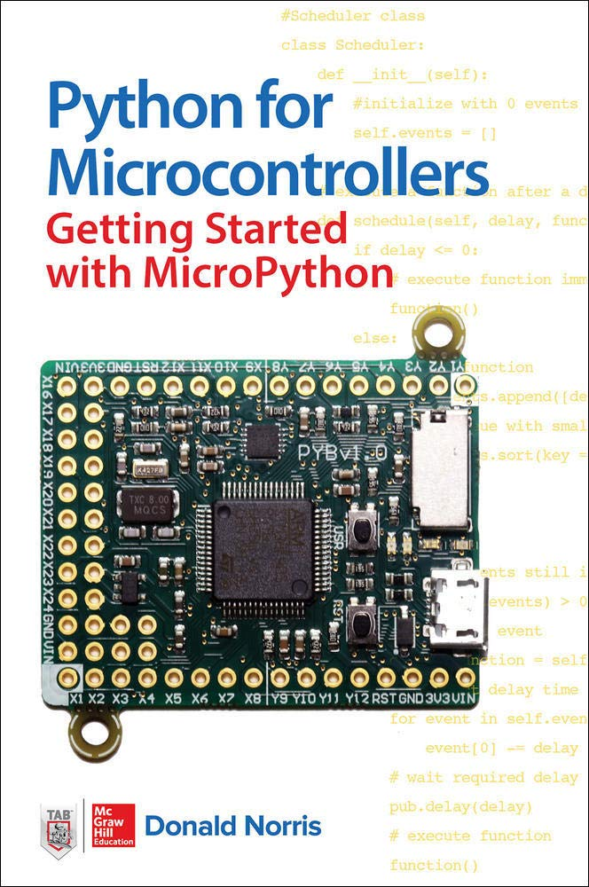 Python for Microcontrollers: Getting Started with MicroPython
 Programming with MicroPython